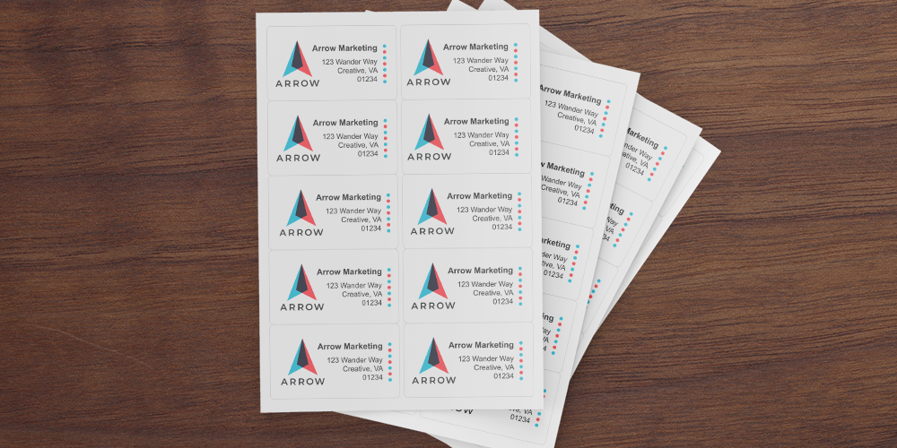
What Are the Best Fonts for Address Labels?

Choosing the right font for address labels is key to making labels that are clear and easy to read while adding a bit of style. The best fonts for address labels combine readability, professionalism, and personality, so they match your brand or personal style. Whether you’re making product labels or return address labels, here’s everything you need to pick the right font.
Why Font Choice Matters for Address Labels
The font you choose affects both the look and readability of your labels. A good font should be easy to read from a distance and shouldn’t strain the eyes.
- Legibility: The font should be readable, even when it’s smaller. This keeps your address labels looking clear and professional.
- Professional Look: Choosing the right font makes your labels look polished and attractive. This helps product labels appear more reliable and stylish.
- Style: Different fonts give off different vibes. Serif fonts look traditional, while sans serif fonts feel more modern. Picking the right style can help reinforce your brand.
Recommended Fonts for Address Labels
Here are some tried-and-true fonts that offer both readability and style for your labels:

Sans Serif Fonts
Sans serif fonts have a clean, modern look, making them popular for address labels. They don’t have extra “feet” or details, so they’re easy to read, even at small sizes.
- Open Sans: This simple, stylish font is a favorite for address labels and other printed materials.
- Arial: A classic choice that’s clear and professional—perfect for labels that need readability.
- Helvetica: Known for its neat, balanced look, Helvetica is a go-to for label design.

Serif Fonts
Serif fonts have small lines or "feet" at the ends of each letter, adding a touch of elegance. These are often chosen for more traditional labels.
- Times New Roman: A timeless font that’s formal but still easy to read, even at smaller sizes.
- Georgia: With thick, clear lines, Georgia balances readability and elegance, making it great for both product and address labels.

Script Fonts
Script fonts are more decorative, resembling cursive handwriting. While they add character, they’re harder to read, so they’re best for decoration rather than critical information.
- Pacifico: A fun, playful script font that works for casual label designs. Use it in larger sizes or decorative parts of the label.
- Brush Script: This adds flair but should be used sparingly on address labels since it can be tough to read when small.
Tips for Choosing the Best Font for Address Labels
Picking the perfect font is all about balancing readability, style, and the purpose of your labels. Here are a few tips to keep in mind:
- Focus on Legibility: Skip overly decorative fonts for the main address text; stick with easy-to-read options like sans serif fonts.
- Match Your Brand: Choose a font that reflects your brand. Modern brands might go with a sans serif font, while traditional brands may lean toward a serif.
- Use Script Fonts Wisely: Script fonts are best for decorative touches, like a name or slogan, rather than the full address.
- Consider Font Size: Make sure the font size is big enough to read comfortably, generally around 10-12 points.
Font Types to Avoid for Address Labels
While some fonts work well, others don’t. Here are a few types to steer clear of:
- Overly Decorative Fonts: Fonts with lots of swirls or flourishes can look great, but they’re hard to read, especially in small sizes. Save these for headings or logos.
- Thin or Light Fonts: While they look stylish, thin fonts can be tough to read on small labels and may not print well.
- All Caps Script Fonts: All caps in a script font is particularly hard to read. Stick to lowercase or mixed case for easier readability.
Popular Fonts for Product Labels
Choosing the right font isn’t just for address labels—it’s important for product labels too. Here are a few popular choices for product labels that can work for address labels as well:
- Open Sans: Clean, modern, and easy to read, making it great for product and address labels alike.
- Roboto: This versatile font works well for both small and large labels, giving a contemporary look.
- Montserrat: A bold, stylish font that makes product labels stand out while staying clear and professional.
Wrapping Up Your Font Choices for Address Labels
Picking the right font for address labels can make a huge difference in both readability and style. The best font combines clarity, professionalism, and a bit of personality.
For a fresh, modern look, try sans serif fonts like Open Sans or Arial. For something more classic, serif fonts like Times New Roman can add sophistication. And if you want a touch of flair, use script fonts sparingly for decorative details.
Ready to start designing your labels? Keep these font tips in mind to make your address labels look polished and easy to read. Get started today by shopping our selection of premium blank address labels. Plus, take advantage of bulk pricing, free shipping, and more from Label Blanks - your trusted source for quality labels, delivered fast.
FAQs: Best Fonts for Address Labels
What is the best font for address labels?
The best font for address labels is usually a sans serif font like Open Sans or Arial. These fonts are highly readable and look professional.
Are script fonts good for address labels?
Script fonts can add personality but are generally harder to read. They are best used for decorative elements, not essential information like addresses.
Should I use serif fonts on address labels?
Serif fonts like Georgia or Times New Roman can work well, especially if you want a traditional or formal look. Just make sure the font size is large enough to read.


